Terraforma — Brand Identity
Terraforma — Branding
An identity pulled out of the word the studio is named after — terraforming. Water, land and green became the three colours; a floor plan became the mark.
The problem
Terraforma is a turn-key architecture studio in Kerala — one team carries a project from first drawing to finished building. They wanted a mark that would still be right in twenty years: nothing of the moment, nothing they'd outgrow, and it had to say what they believe about the spaces they make without spelling it out.
What I did
Went to the name and took it literally. Terraforming is the work of making ground liveable, so the mark became a floor plan reduced to its smallest readable unit — solid where there's mass, open where there isn't. The palette is the site itself, split three ways.
The mark
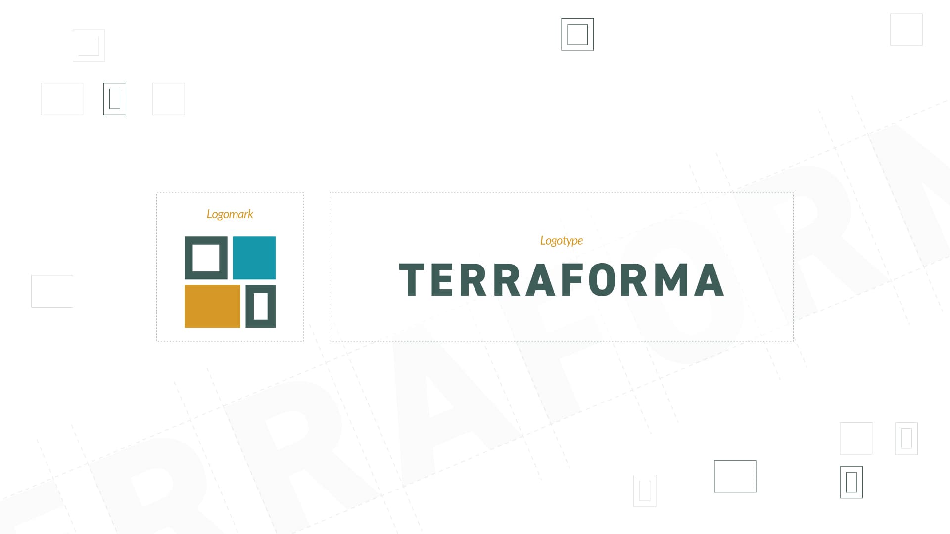
It's a floor plan reduced to its smallest legible unit. Solid where there's mass, open where there isn't — so it reads the way a drawing reads, built against unbuilt.
Colour and type
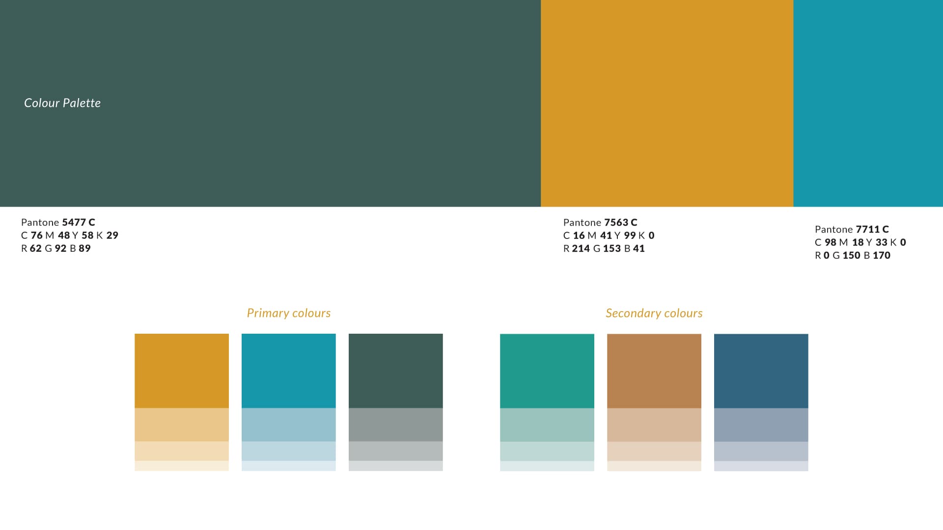
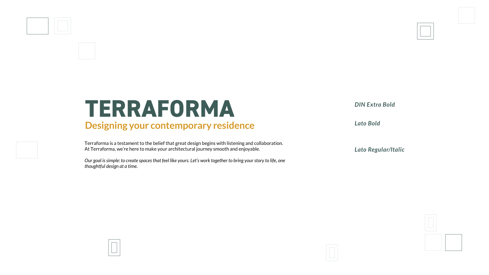
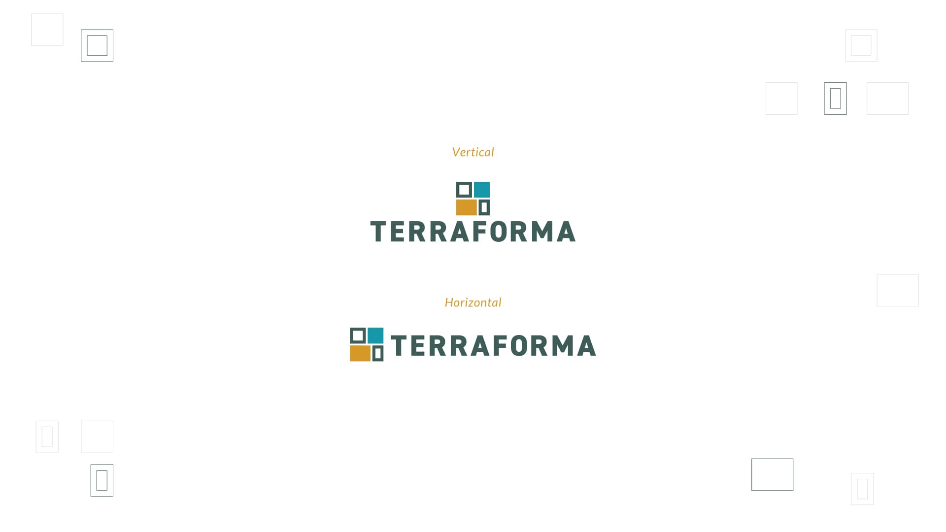
This is the part I'm most attached to. The palette isn't a mood — it's the site itself, split into three. Teal is water, ochre is the land, deep pine is everything that grows on it. Three elements, and a studio whose whole job is bringing them into balance on a plot of ground. Tints extend the three into a working range without letting anything raise its voice.