Dr.Perkz — Brand Identity
Dr.Perkz — Branding
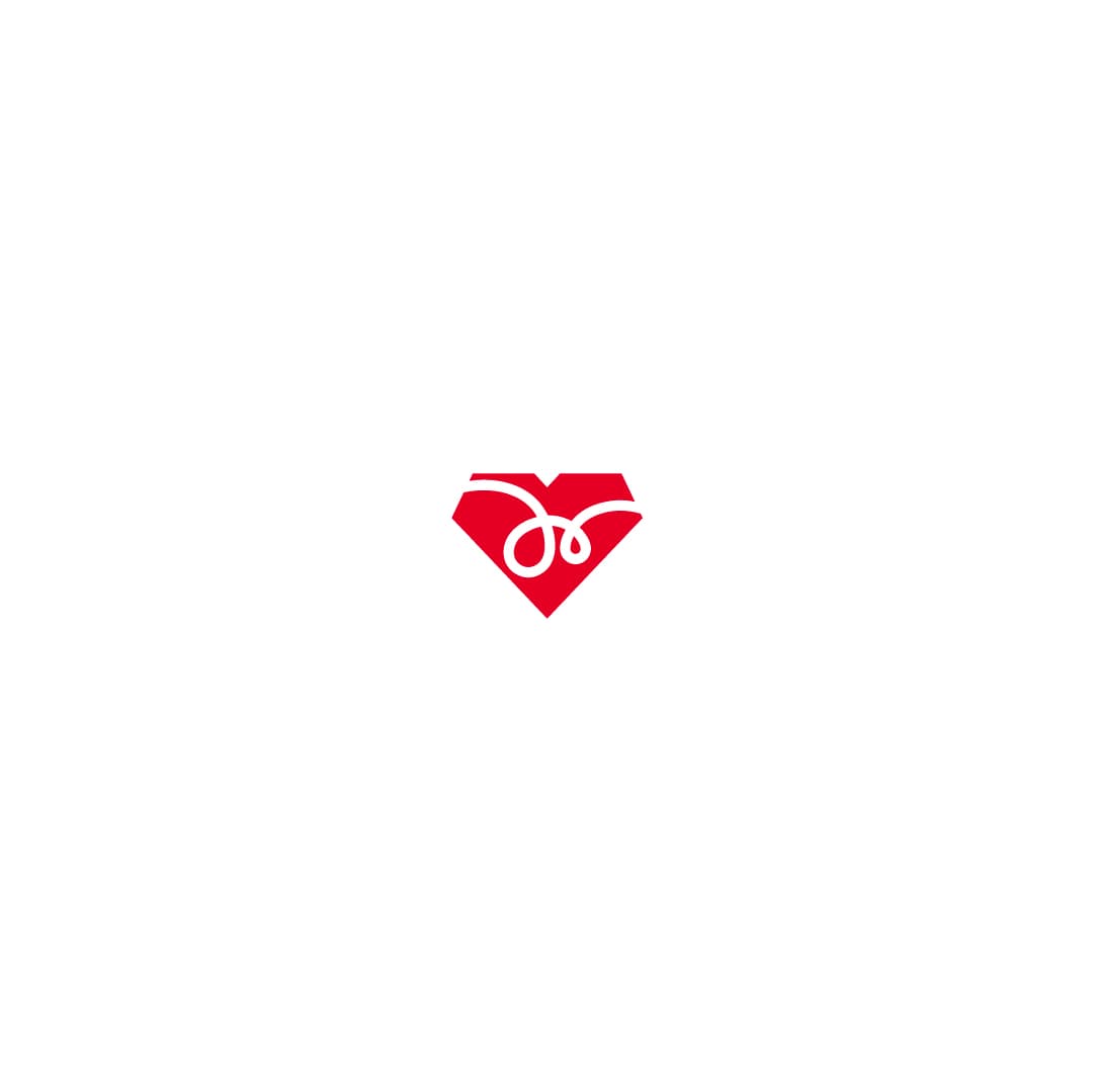
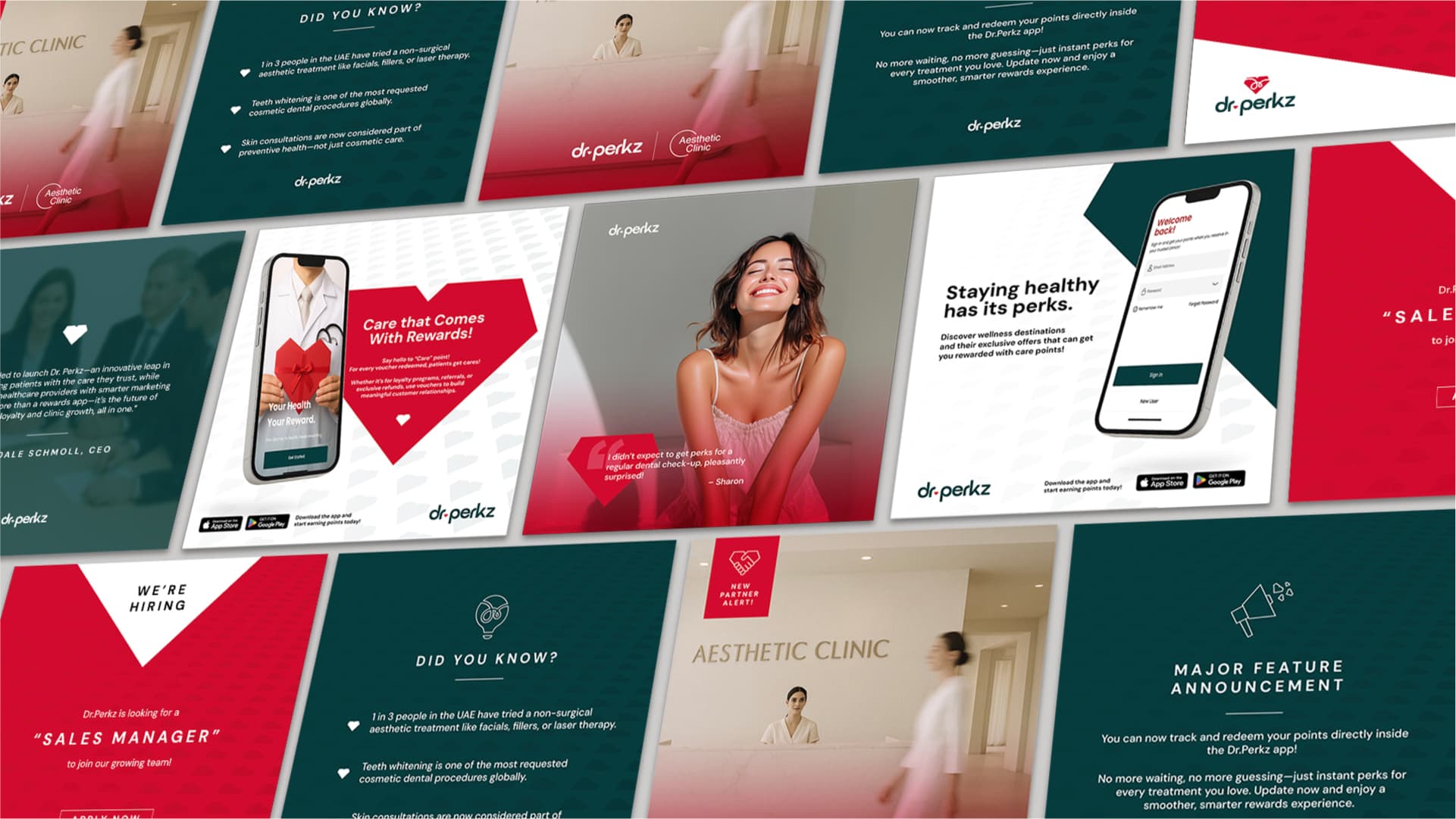
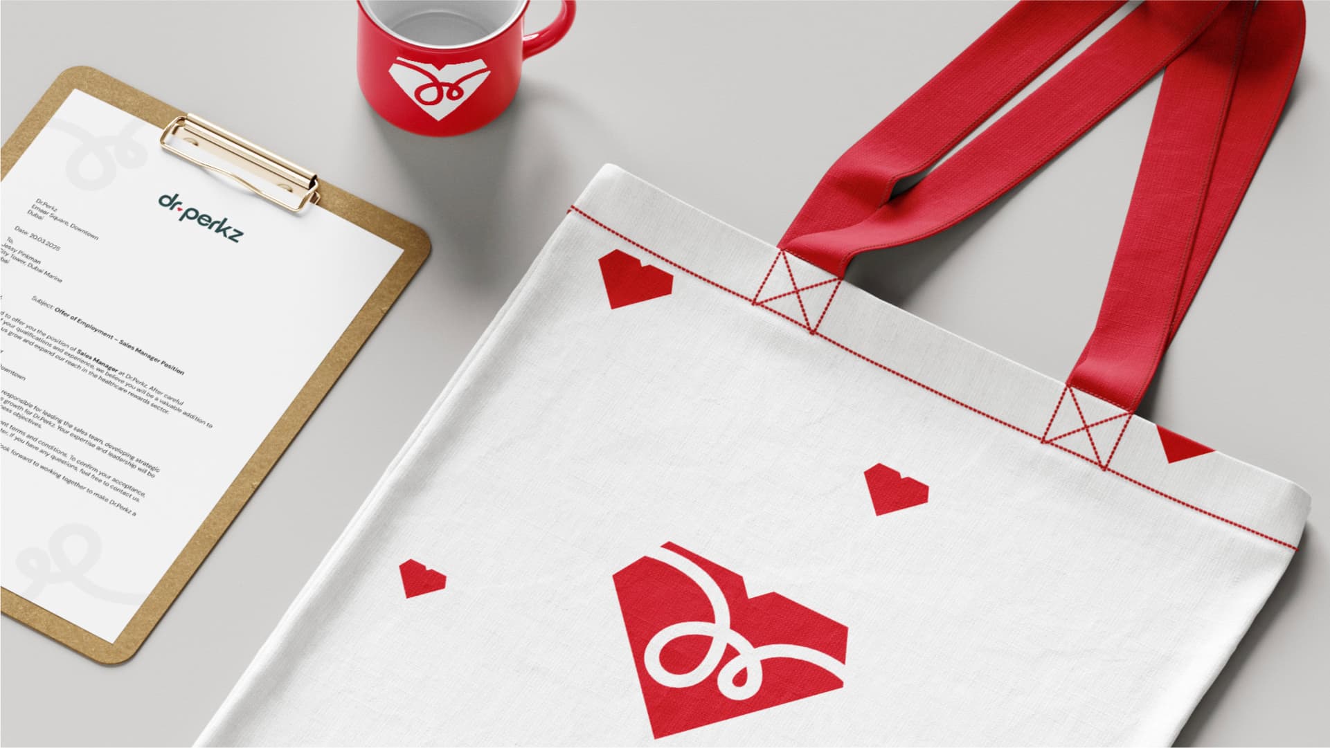
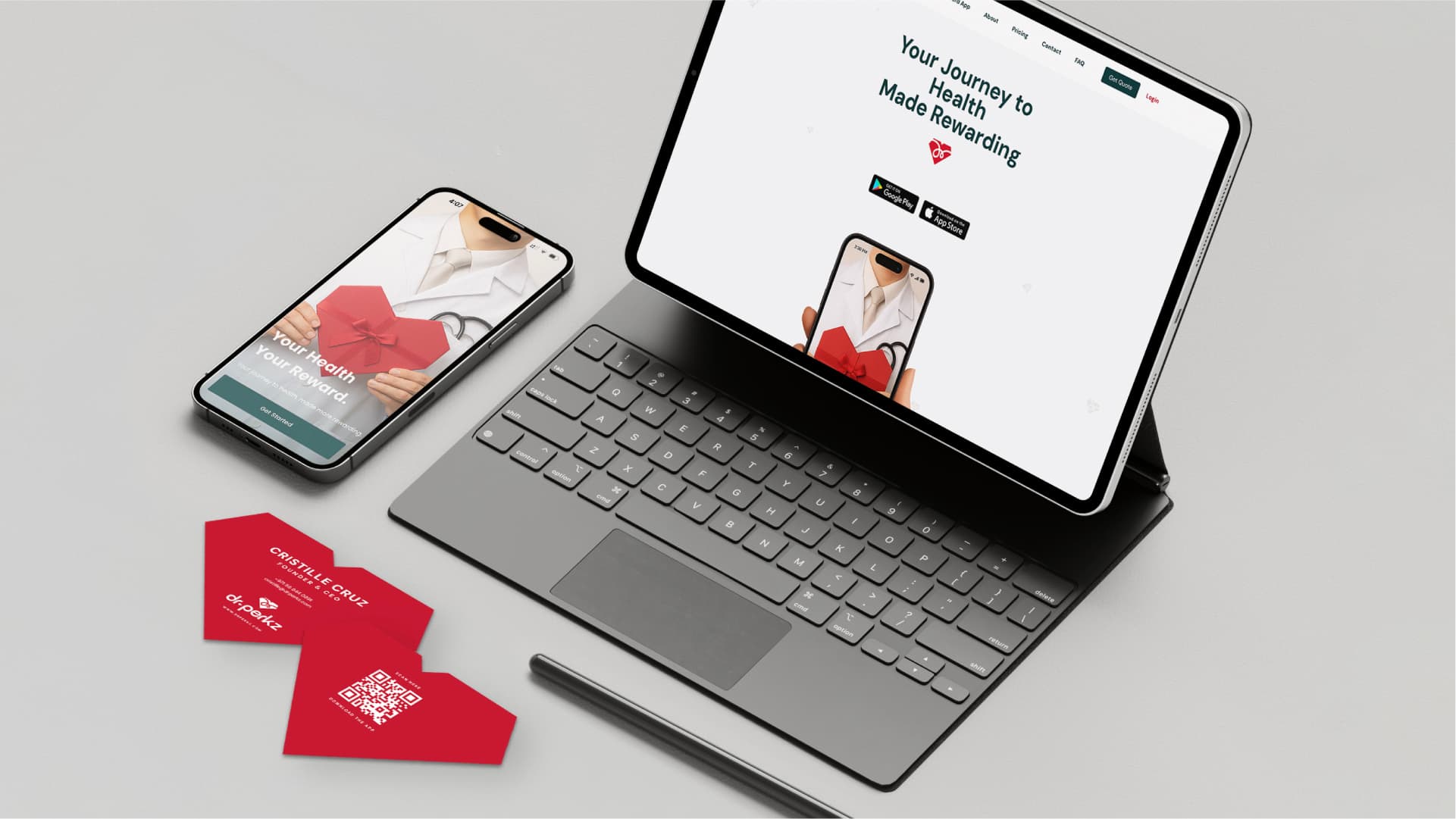
A healthcare rewards app had to feel like both things at once — a clinic you trust and a perk you want. One mark carries both: a heart cut like a gem, with the doctor's signature looped inside.
The problem
Dr.Perkz launched as the first platform in the market to reward people for aesthetic and dental treatment. Being first is a gift and a problem: no category look to borrow from, and no one to be mistaken for. It had to read as healthcare you trust and a reward you want, at the same time.
What I did
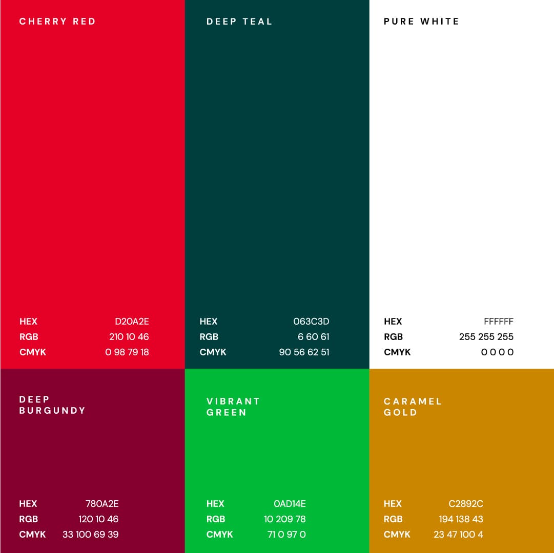
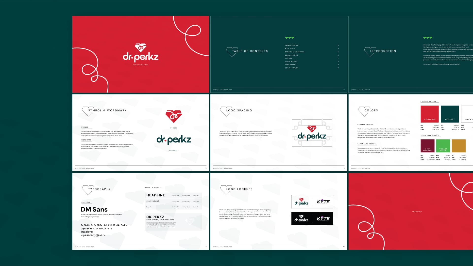
Built the identity around one shape doing double duty — a heart cut like a gem, with a doctor's signature looped inside. Care and value in a single mark. Then a palette that refuses to look clinical, and a full set of rules so it holds together everywhere they turn up.